Echarts使用小结
10 min

这周项目上写了一个基于Angular2.0的Echarts3组件,踩了好几个坑,也算有一点使用心得了。
Echarts是什么鬼
ECharts 是指 Enterprise Charts(商业产品图表库),提供商业产品常用图表库,底层基于 ZRender,创建了坐标系,图例,提示,工具箱等基础组件,并在此上构建出折线图(区域图)、柱状图(条状图)、散点图(气泡图)、K线图、饼图(环形图)、地图、力导向布局图,同时支持任意维度的堆积和多图表混合展现。
Echarts提供了多种图表展示方式:
Echarts提供了包括值域漫游、大规模散点图、数据动态添加、数据区域漫游、图例开关、动态类型切换等在内的多种数据操作方式。Echarts升级到3.0后,增加了对移动端的支持,而且体积更小,实乃数据分析必备良药。
Echarts正确打开方式
首先来看官方案例:
<!DOCTYPE html>
<html>
<head>
    <meta charset="utf-8">
    <title>ECharts</title>
    <!-- 引入 echarts.js -->
    <script src="echarts.min.js"></script>
</head>
<body>
    <!-- 为ECharts准备一个具备大小(宽高)的Dom -->
    <div id="main" style="width: 600px;height:400px;"></div>
    <script type="text/javascript">
        // 基于准备好的dom,初始化echarts实例
        var myChart = echarts.init(document.getElementById('main'));

        // 指定图表的配置项和数据
        var option = {
            title: {
                text: 'ECharts 入门示例'
            },
            tooltip: {},
            legend: {
                data:['销量']
            },
            xAxis: {
                data: ["衬衫","羊毛衫","雪纺衫","裤子","高跟鞋","袜子"]
            },
            yAxis: {},
            series: [{
                name: '销量',
                type: 'bar',
                data: [5, 20, 36, 10, 10, 20]
            }]
        };

        // 使用刚指定的配置项和数据显示图表。
        myChart.setOption(option);
    </script>
</body>
</html>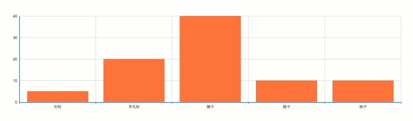
怎么样,是不是觉得很好玩,当然这只是最基本的数据展示功能,下面我们来玩一个进阶一点的Demo。
<!DOCTYPE html>
<html>
<head>
<meta charset="gb2312">
<title>echarts3</title>
</head>
<body>
<h1>echarts3 demo</h1>
<!--定义有大小的DOM容器-->
<div id="barChart" style="width: 100%;height:600px;"></div>
<div id="lineChart" style="width: 100%;height:600px;"></div>
<div id="radarChart" style="width: 100%;height:600px;"></div>
<div id="pieChart" style="width: 100%;height:600px;"></div>
<div id="dotChart" style="width: 100%;height:600px;"></div>
<!--导入js代码-->
<script type="text/javascript" src='./jquery.js'></script>
<script type="text/javascript" src='./echarts.js'></script>
<script type="text/javascript">
//界面最先运行这个代码块
$(document).ready(function() {
initBarEcharts();
initLineEcharts();
initRadarEcharts();
initPieEcharts();
initDotEcharts();
});
//初始化柱状图
function initBarEcharts() {
var myChart = echarts.init(document.getElementById('barChart'));
// 指定图表的配置项和数据
var option = {
title: {
text: 'ECharts 入门示例'
},
dataZoom: {
type: 'slider',
show: true,
start: 1,
end: 35
},
tooltip: {},
toolbox: {
show: true,
feature: {
saveAsImage: {
show: true,
type: 'jpeg',
},
restore: {
show: true,
},
dataView: {
show: true,
},
magicType: {
show: true,
}
},
},
legend: {
data: ['销量']
},
xAxis: {
//x轴数据,数组形式
data: ["衬衫", "羊毛衫", "雪纺衫", "裤子", "高跟鞋", "袜子"]
},
yAxis: {},
series: [{
name: '销量',
type: 'bar',
data: [5, 20, 36, 10, 10, 20]
}]
};
// 使用刚指定的配置项和数据显示图表。
myChart.setOption(option);
}
//初始化折线图图
function initLineEcharts() {
var myChart = echarts.init(document.getElementById('lineChart'));
// 指定图表的配置项和数据
option = {
title: {
text: '堆叠区域图'
},
tooltip: {
trigger: 'axis'
},
legend: {
data: ['邮件营销', '联盟广告', '视频广告', '直接访问', '搜索引擎']
},
toolbox: {
feature: {
saveAsImage: {}
}
},
grid: {
left: '3%',
right: '4%',
bottom: '3%',
containLabel: true
},
xAxis: [{
type: 'category',
boundaryGap: false,
data: ['周一', '周二', '周三', '周四', '周五', '周六', '周日']
}],
yAxis: [{
type: 'value'
}],
series: [{
name: '邮件营销',
type: 'line',
stack: '总量',
areaStyle: {
normal: {}
},
data: [120, 132, 101, 134, 90, 230, 210]
}, {
name: '联盟广告',
type: 'line',
stack: '总量',
areaStyle: {
normal: {}
},
data: [220, 182, 191, 234, 290, 330, 310]
}, {
name: '视频广告',
type: 'line',
stack: '总量',
areaStyle: {
normal: {}
},
data: [150, 232, 201, 154, 190, 330, 410]
}, {
name: '直接访问',
type: 'line',
stack: '总量',
areaStyle: {
normal: {}
},
data: [320, 332, 301, 334, 390, 330, 320]
}, {
name: '搜索引擎',
type: 'line',
stack: '总量',
label: {
normal: {
show: true,
position: 'top'
}
},
areaStyle: {
normal: {}
},
data: [820, 932, 901, 934, 1290, 1330, 1320]
}]
};
// 使用刚指定的配置项和数据显示图表。
myChart.setOption(option);
}
//初始化雷达图
function initRadarEcharts() {
var myChart = echarts.init(document.getElementById('radarChart'));
// 指定图表的配置项和数据
option = {
title: {
text: '基础雷达图'
},
tooltip: {},
legend: {
data: ['预算分配(Allocated Budget)', '实际开销(Actual Spending)']
},
radar: {
// shape: 'circle',
indicator: [{
name: '销售(sales)',
max: 6500
}, {
name: '管理(Administration)',
max: 16000
}, {
name: '信息技术(Information Techology)',
max: 30000
}, {
name: '客服(Customer Support)',
max: 38000
}, {
name: '研发(Development)',
max: 52000
}, {
name: '市场(Marketing)',
max: 25000
}]
},
series: [{
name: '预算 vs 开销(Budget vs spending)',
type: 'radar',
// areaStyle: {normal: {}},
data: [{
value: [4300, 10000, 28000, 35000, 50000, 19000],
name: '预算分配(Allocated Budget)'
}, {
value: [5000, 14000, 28000, 31000, 42000, 21000],
name: '实际开销(Actual Spending)'
}]
}]
};
// 使用刚指定的配置项和数据显示图表。
myChart.setOption(option);
}
//初始化饼图
function initPieEcharts() {
var myChart = echarts.init(document.getElementById('pieChart'));
// 指定图表的配置项和数据
option = {
backgroundColor: '#2c343c',
title: {
text: 'Customized Pie',
left: 'center',
top: 20,
textStyle: {
color: '#ccc'
}
},
tooltip: {
trigger: 'item',
formatter: "{a} <br/>{b} : {c} ({d}%)"
},
visualMap: {
show: false,
min: 80,
max: 600,
inRange: {
colorLightness: [0, 1]
}
},
series: [{
name: '访问来源',
type: 'pie',
radius: '55%',
center: ['50%', '50%'],
data: [{
value: 335,
name: '直接访问'
}, {
value: 310,
name: '邮件营销'
}, {
value: 274,
name: '联盟广告'
}, {
value: 235,
name: '视频广告'
}, {
value: 400,
name: '搜索引擎'
}].sort(function(a, b) {
return a.value - b.value
}),
roseType: 'angle',
label: {
normal: {
textStyle: {
color: 'rgba(255, 255, 255, 0.3)'
}
}
},
labelLine: {
normal: {
lineStyle: {
color: 'rgba(255, 255, 255, 0.3)'
},
smooth: 0.2,
length: 10,
length2: 20
}
},
itemStyle: {
normal: {
color: '#c23531',
shadowBlur: 200,
shadowColor: 'rgba(0, 0, 0, 0.5)'
}
}
}]
};
// 使用刚指定的配置项和数据显示图表。
myChart.setOption(option);
}
//初始化散点图
function initDotEcharts() {
var myChart = echarts.init(document.getElementById('dotChart'));
// 指定图表的配置项和数据
var data = [
[
[28604, 77, 17096869, 'Australia', 1990],
[31163, 77.4, 27662440, 'Canada', 1990],
[1516, 68, 1154605773, 'China', 1990],
[13670, 74.7, 10582082, 'Cuba', 1990],
[28599, 75, 4986705, 'Finland', 1990],
[29476, 77.1, 56943299, 'France', 1990],
[31476, 75.4, 78958237, 'Germany', 1990],
[28666, 78.1, 254830, 'Iceland', 1990],
[1777, 57.7, 870601776, 'India', 1990],
[29550, 79.1, 122249285, 'Japan', 1990],
[2076, 67.9, 20194354, 'North Korea', 1990],
[12087, 72, 42972254, 'South Korea', 1990],
[24021, 75.4, 3397534, 'New Zealand', 1990],
[43296, 76.8, 4240375, 'Norway', 1990],
[10088, 70.8, 38195258, 'Poland', 1990],
[19349, 69.6, 147568552, 'Russia', 1990],
[10670, 67.3, 53994605, 'Turkey', 1990],
[26424, 75.7, 57110117, 'United Kingdom', 1990],
[37062, 75.4, 252847810, 'United States', 1990]
],
[
[44056, 81.8, 23968973, 'Australia', 2015],
[43294, 81.7, 35939927, 'Canada', 2015],
[13334, 76.9, 1376048943, 'China', 2015],
[21291, 78.5, 11389562, 'Cuba', 2015],
[38923, 80.8, 5503457, 'Finland', 2015],
[37599, 81.9, 64395345, 'France', 2015],
[44053, 81.1, 80688545, 'Germany', 2015],
[42182, 82.8, 329425, 'Iceland', 2015],
[5903, 66.8, 1311050527, 'India', 2015],
[36162, 83.5, 126573481, 'Japan', 2015],
[1390, 71.4, 25155317, 'North Korea', 2015],
[34644, 80.7, 50293439, 'South Korea', 2015],
[34186, 80.6, 4528526, 'New Zealand', 2015],
[64304, 81.6, 5210967, 'Norway', 2015],
[24787, 77.3, 38611794, 'Poland', 2015],
[23038, 73.13, 143456918, 'Russia', 2015],
[19360, 76.5, 78665830, 'Turkey', 2015],
[38225, 81.4, 64715810, 'United Kingdom', 2015],
[53354, 79.1, 321773631, 'United States', 2015]
]
];
option = {
backgroundColor: new echarts.graphic.RadialGradient(0.3, 0.3, 0.8, [{
offset: 0,
color: '#f7f8fa'
}, {
offset: 1,
color: '#cdd0d5'
}]),
title: {
text: '1990 与 2015 年各国家人均寿命与 GDP'
},
legend: {
right: 10,
data: ['1990', '2015']
},
xAxis: {
splitLine: {
lineStyle: {
type: 'dashed'
}
}
},
yAxis: {
splitLine: {
lineStyle: {
type: 'dashed'
}
},
scale: true
},
series: [{
name: '1990',
data: data[0],
type: 'scatter',
symbolSize: function(data) {
return Math.sqrt(data[2]) / 5e2;
},
label: {
emphasis: {
show: true,
formatter: function(param) {
return param.data[3];
},
position: 'top'
}
},
itemStyle: {
normal: {
shadowBlur: 10,
shadowColor: 'rgba(120, 36, 50, 0.5)',
shadowOffsetY: 5,
color: new echarts.graphic.RadialGradient(0.4, 0.3, 1, [{
offset: 0,
color: 'rgb(251, 118, 123)'
}, {
offset: 1,
color: 'rgb(204, 46, 72)'
}])
}
}
}, {
name: '2015',
data: data[1],
type: 'scatter',
symbolSize: function(data) {
return Math.sqrt(data[2]) / 5e2;
},
label: {
emphasis: {
show: true,
formatter: function(param) {
return param.data[3];
},
position: 'top'
}
},
itemStyle: {
normal: {
shadowBlur: 10,
shadowColor: 'rgba(25, 100, 150, 0.5)',
shadowOffsetY: 5,
color: new echarts.graphic.RadialGradient(0.4, 0.3, 1, [{
offset: 0,
color: 'rgb(129, 227, 238)'
}, {
offset: 1,
color: 'rgb(25, 183, 207)'
}])
}
}
}]
};
// 使用刚指定的配置项和数据显示图表。
myChart.setOption(option);
}
</script>
</body>
</html>
Echarts与Angular2.0
我做组件的时候定义了ky-line标签,通过<ky-line [data]="myoption"></ky-line>里的data属性来传递option的数据,这样拿到后端的数据后,往myoption里面push数据,并通过ky-line标签,把数据传递给Echarts中的option,这样就可以实现给echarts动态写入数据。不过要注意的是,给echarts中动态增加数据的时候,首先要搞清楚json对象和json数组的概念,不然容易出错。
欢迎关注我的其它发布渠道
WeChat